

Website Development
Red Education
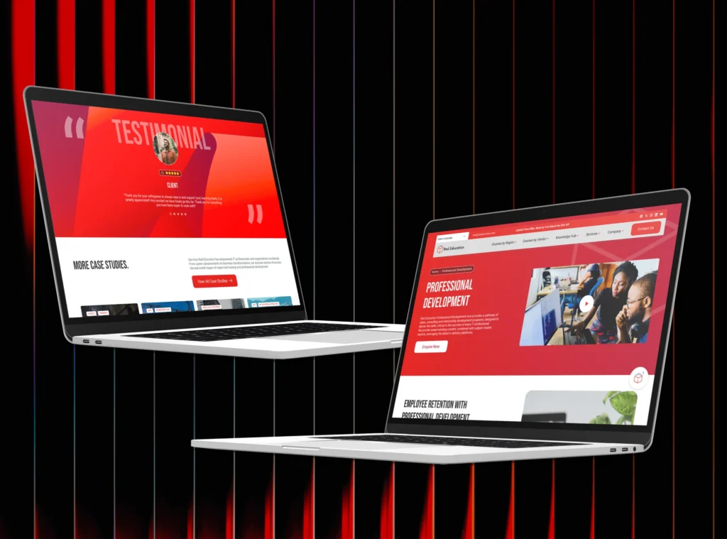
A strategic digital transformation that helped Red Education increase global search visibility, grow organic traffic, and establish itself as a recognised leader in IT training and certification.

Alfa Clean was ready for the next stage of the business, a commercial-first, ESG-led future with bigger clients, higher-value contracts, and a market that increasingly demands proof of environmental responsibility. The brand they had wasn’t built for that stage. It wasn’t built for any particular stage.
Their audience is busy. Operational decision-makers don’t linger. They scan, evaluate, and move — and if a brand doesn’t communicate trust and capability immediately, the moment is gone. Alfa Clean needed a visual identity that could do that work fast, and do it consistently across every touchpoint.
We came in to build a brand that was as serious as the business behind it.
Alfa Clean was ready for the next stage of the business — a commercial-first, ESG-led future with bigger clients, higher-value contracts, and a market that increasingly demands proof of environmental responsibility. The brand they had wasn’t built for that stage. It wasn’t built for any particular stage.
Their audience is busy. Operational decision-makers don’t linger. They scan, evaluate, and move — and if a brand doesn’t communicate trust and capability immediately, the moment is gone. Alfa Clean needed a visual identity that could do that work fast, and do it consistently across every touchpoint.
We came in to build a brand that was as serious as the business behind it.
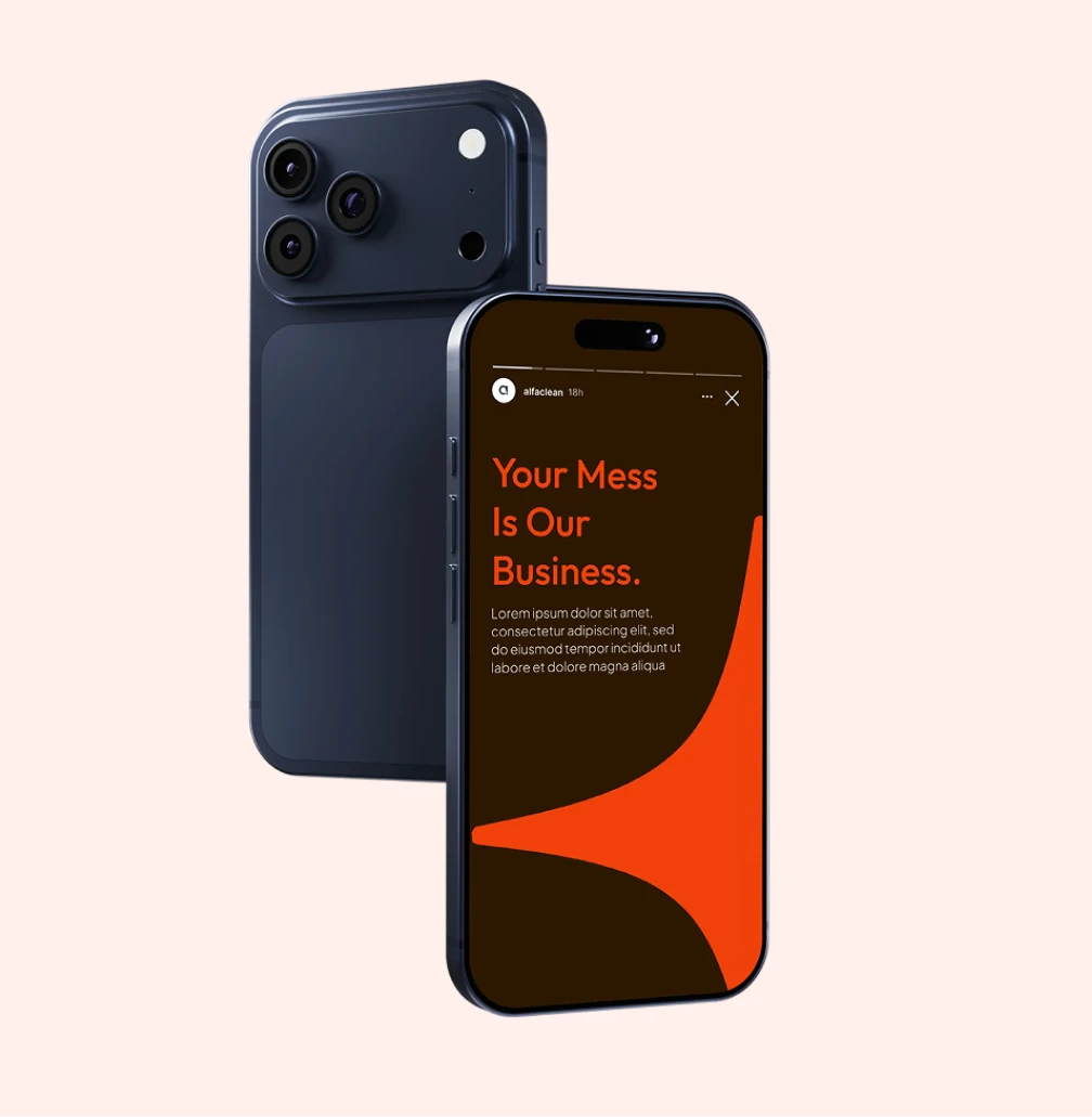
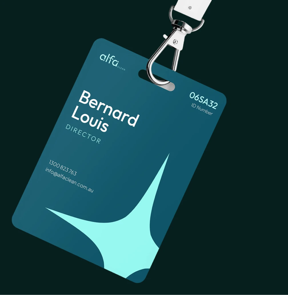
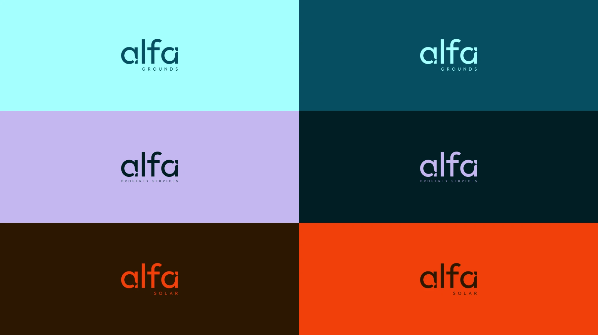
Alfa Clean's offer was strong, but the brand wasn't making the case. There was no clear signal of who they served, what they stood for, or why they were the right choice over competitors.
The business had genuine environmental and governance commitments. The brand didn't show them. In a market where ESG credentials increasingly influence procurement decisions, this was a commercial gap.
The primary audience, operational leaders at commercial scale needed to understand Alfa Clean's value instantly. The old brand created friction where there should have been clarity.
The existing identity didn't reflect the level of business Alfa Clean was ready to operate at. It needed to grow — to signal responsibility, capability, and forward momentum without a word being read.
We started by defining exactly where Alfa Clean sits in the market and where they’re going. ESG-led, commercial-first, future-focused these weren’t just adjectives, they became the strategic pillars that every design and communications decision was built around.
The primary audience, operational decision-makers, drove every structural choice. If something didn’t help a busy evaluator understand value faster, it didn’t make the cut.
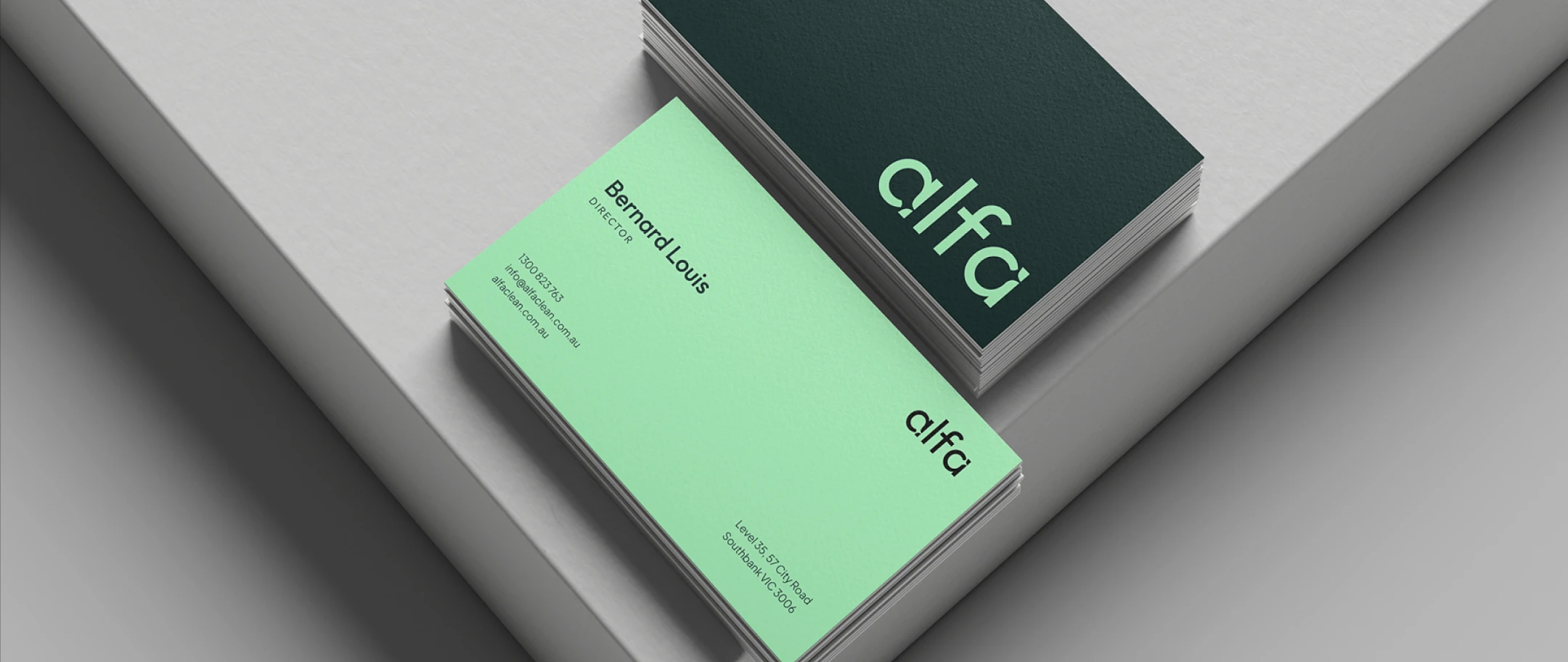
With the strategy in place, we built a visual system that made the positioning visible. An earthy-modern palette — earth-influenced tones paired with clean neutrals — communicates the natural world Alfa Clean is committed to protecting. Curved elements and organic shapes reinforce responsibility and balance without resorting to obvious green iconography.
Every visual choice was made with the operational decision-maker in mind. Clarity over complexity. Credibility over decoration.
The complete identity system was documented in brand guidelines built to be used — not filed away. Every element defined with enough precision that the brand behaves consistently whether it’s applied internally or externally, at launch or three years from now.
The new website was built to the same standard: structured for clarity, optimised for search, and designed to convert the exact audience the brand is targeting.
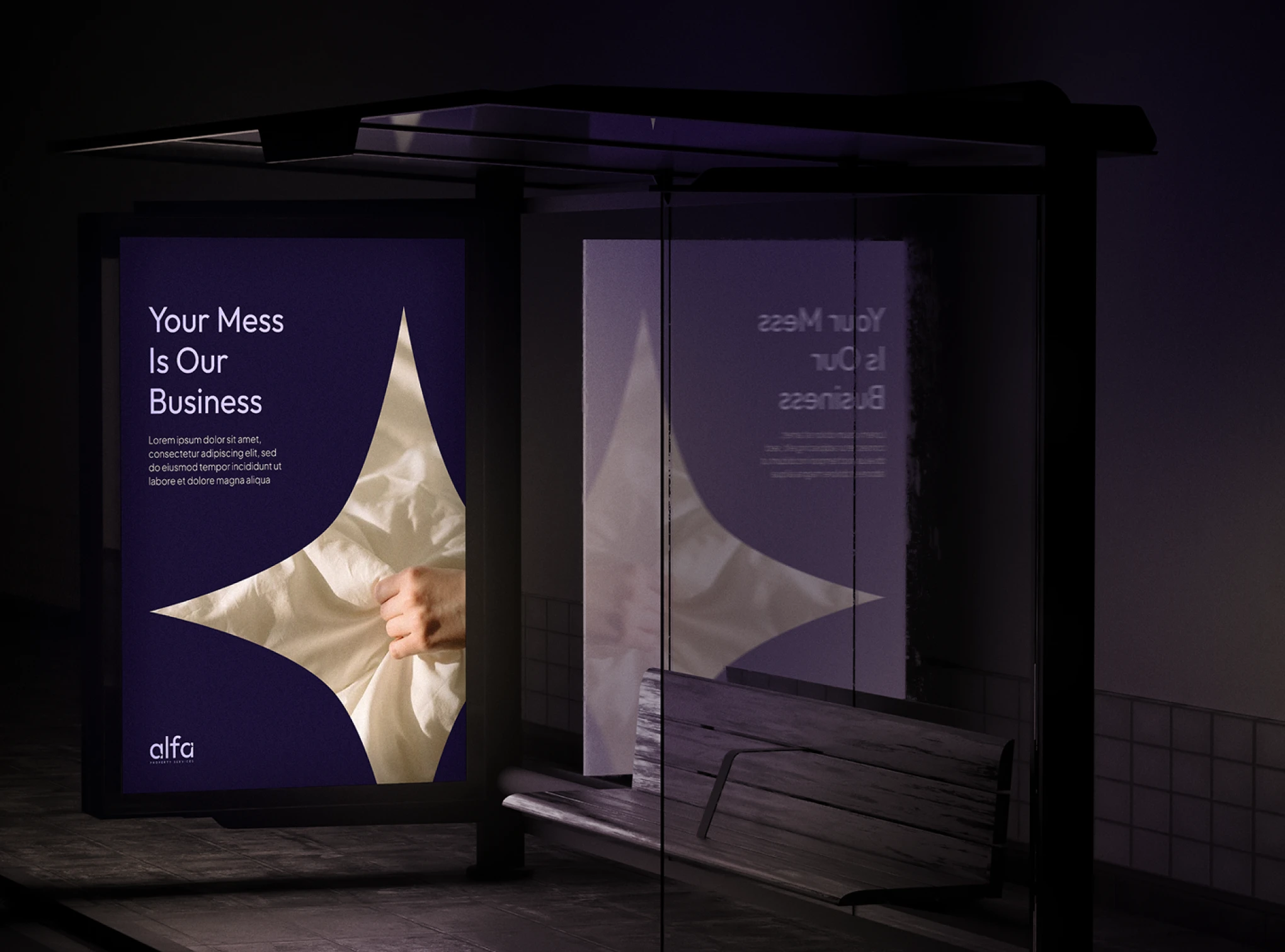
A visual identity built for the commercial stage they were ready to step onto. ESG credentials made visible through design. An information architecture that respects the decision-maker’s time and removes friction from the evaluation process.
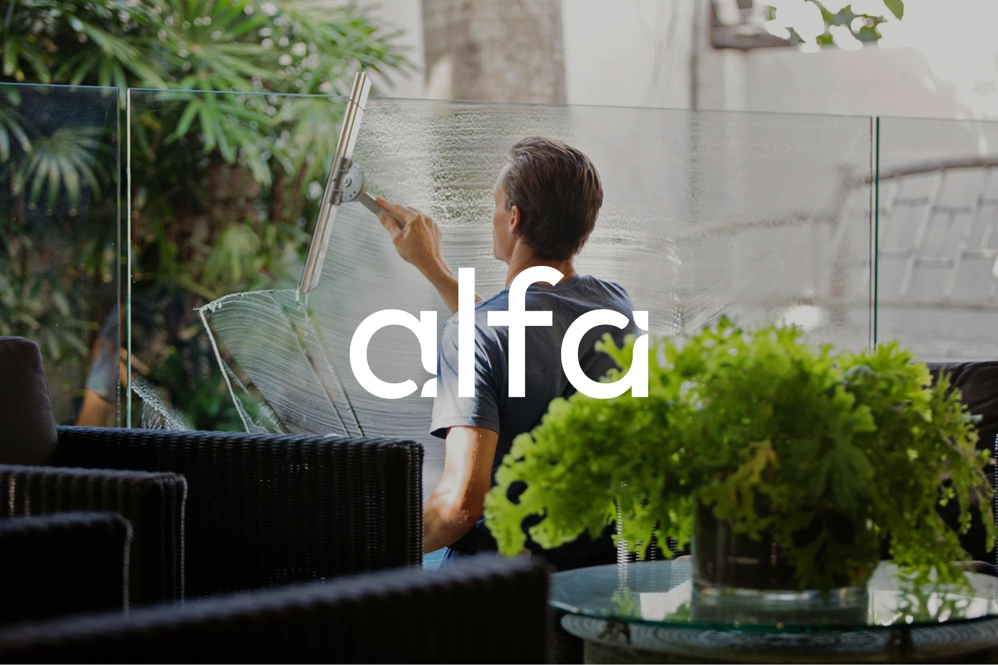
By centering sustainability as a structural design principle, not a marketing badge and building for the decision-maker rather than the designer, Alfa Clean now has a brand that works as hard as the business does. Credible, clear, and built for the commercial future they’re walking into.
These case studies showcase the journeys of clients who navigated obstacles and achieved their objectives.