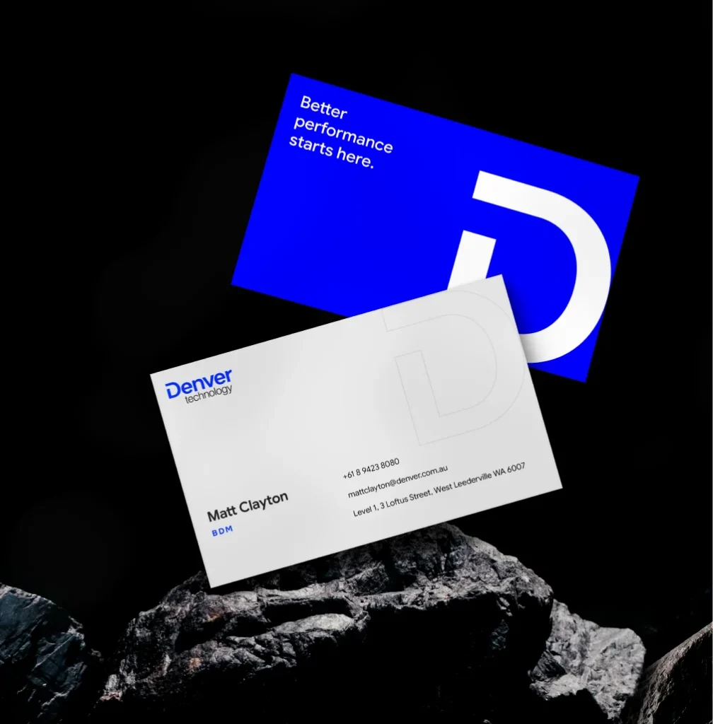

Website Development
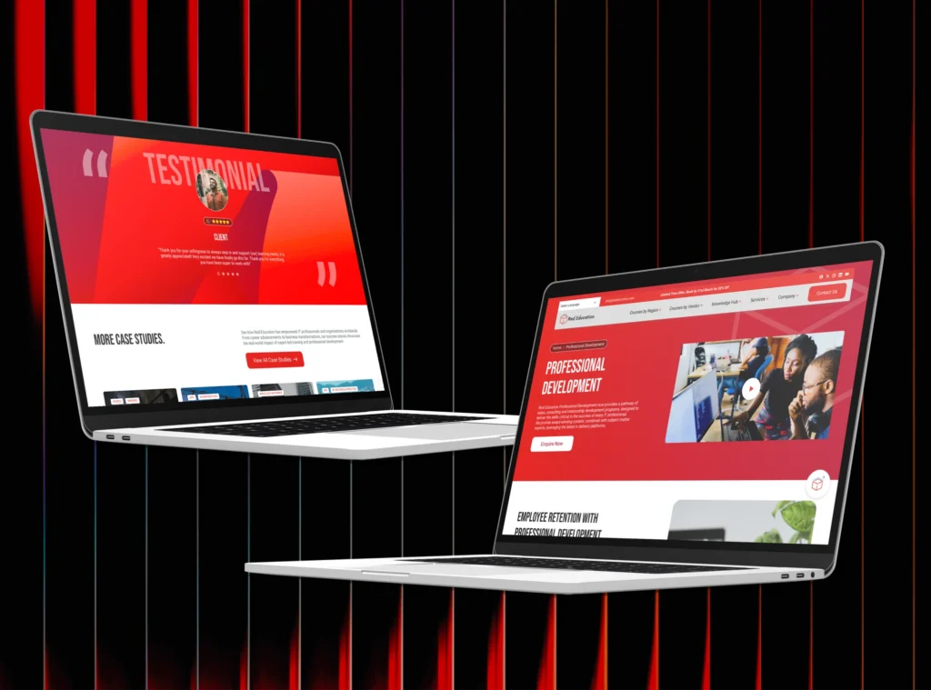
Red Education
A strategic digital transformation that helped Red Education increase global search visibility, grow organic traffic, and establish itself as a recognised leader in IT training and certification.
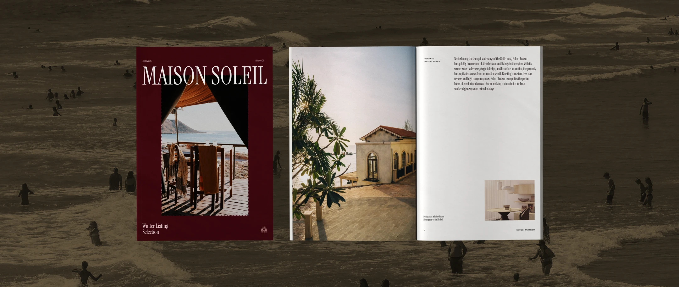
There was no existing brand to evolve. No legacy to work with. No visual history to respect or refine. Maison Soleil came to us as a concept. A luxury accommodation offering with a clear vision and nothing else on paper.
The brief was to build a brand that could walk into the luxury market with complete confidence from day one. Not as a newcomer trying to earn credibility, but as a brand that already understood exactly who it was and who it was for. In luxury, that authority has to be felt before it’s explained.
The concept lives at the intersection of two distinct worlds – European refinement and the unhurried warmth of coastal escape. The brand needed to hold both with equal conviction. That requires more than visual flair. It requires getting the strategy right first.

Unlike a rebrand, there was no starting point. No colour history, no existing audience expectation, no visual shorthand to lean on. Every element had to be created and validated from scratch — with nothing to iterate from.
The luxury market has a high bar for entry. A brand that looks like it's trying to be luxury is worse than one that doesn't try at all. Maison Soleil had to arrive fully formed — considered, curated, and confident.
European refinement and coastal ease don't naturally sit together. One is structured and architectural. The other is warm and unhurried. The brand needed to hold both simultaneously without either diluting the other.
With no brand history, there was no established way of doing anything. Typography, colour, tone, layout, photography direction — all had to be decided, documented, and made coherent across an entire brand system in a single engagement.
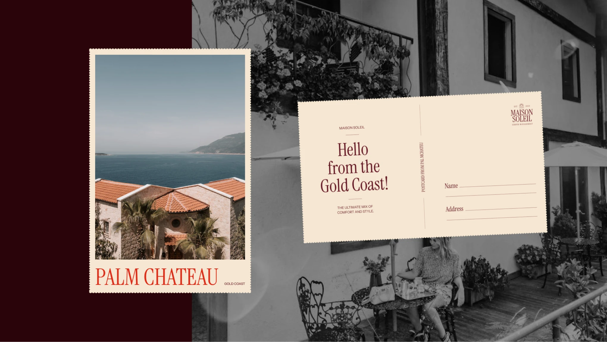
Before any visual work began, we established exactly what Maison Soleil stands for, who it speaks to, and what every touchpoint should make them feel. The answer: the quiet confidence of a well-travelled host. Someone who values atmosphere over spectacle, experience over excess, and detail over volume.
That idea, specific, felt, and entirely ownable became the creative north for everything that followed.
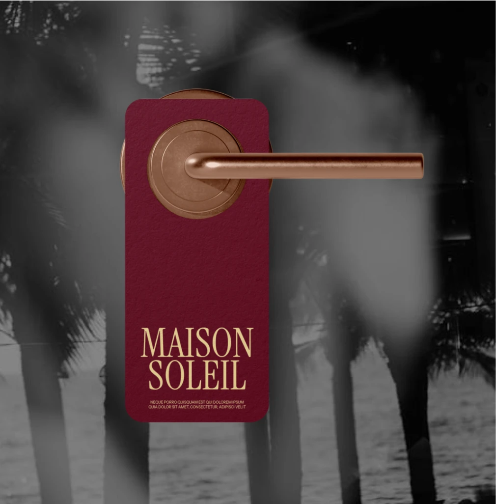
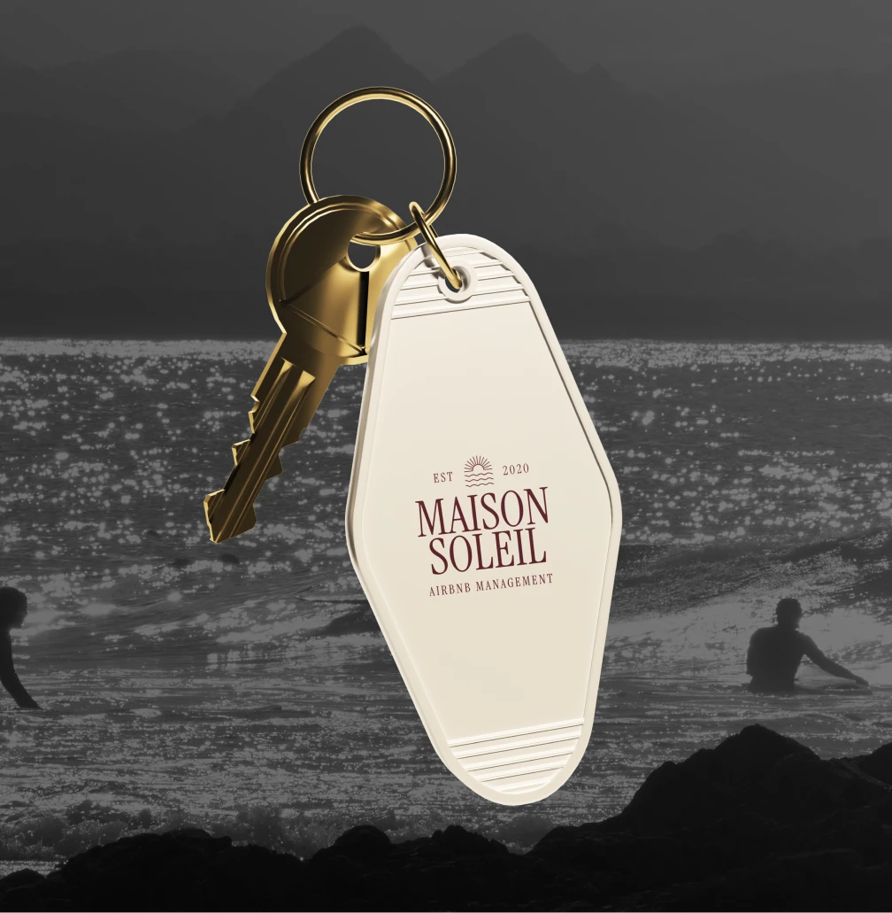
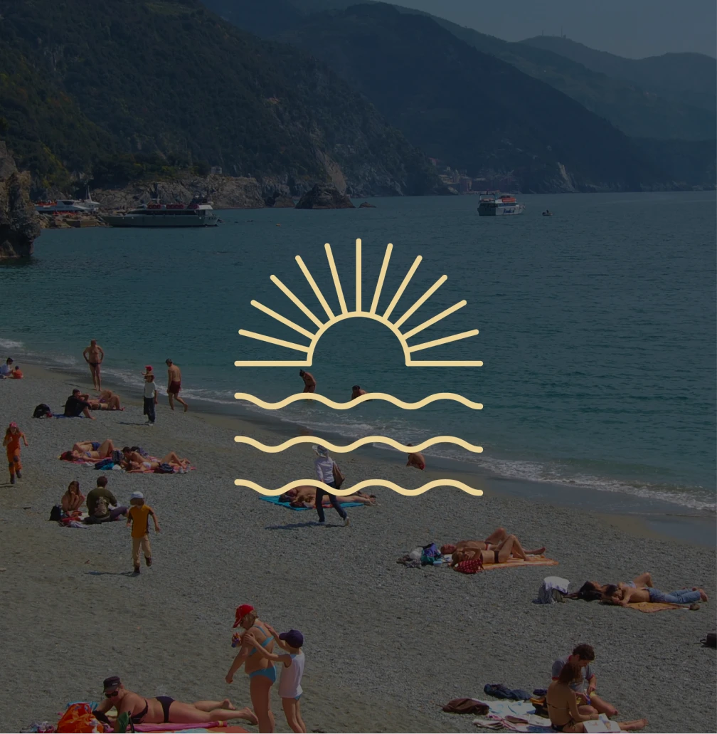
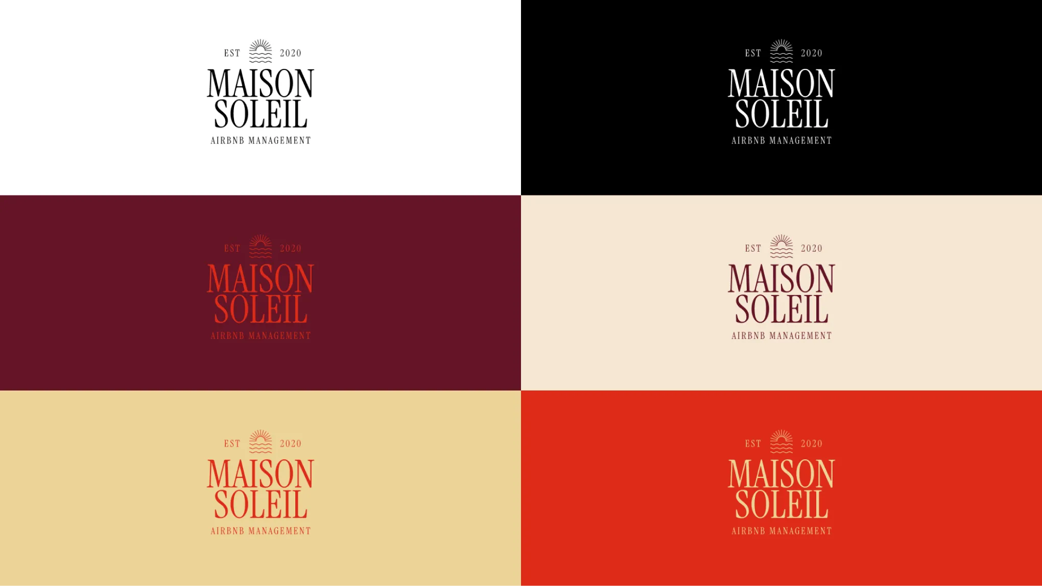
With the positioning established, we built a visual world around it. The palette was anchored in warmth and depth — rich wine tones, sunlit neutrals, soft creams, and buttery hues that evoke natural light and open space. Colours chosen not for trend but for feeling.
Typography pairs expressive editorial-style serif moments with clean, modern sans-serif foundations — creating a deliberate contrast between heritage and clarity that runs through every application. The shapes, the spacing, the composition — nothing arbitrary. Everything considered.
A brand built without documentation is a brand that can’t be used consistently. We delivered comprehensive brand guidelines that define not just what the brand looks like, but why every decision was made — so the brand can be applied by anyone, anywhere, and still feel like Maison Soleil.
Every rule is paired with its intention. Because a team that understands the thinking makes better decisions than one that just follows instructions.
A complete identity system — built entirely from scratch — that communicates quiet luxury, European refinement, and coastal warmth in a single visual language. Coherent across every touchpoint. Ready to deploy from day one.
Starting from nothing is the hardest brief in branding. There is no shorthand, no existing equity, no audience expectation to leverage. Everything has to be earned through the quality of the thinking and the precision of the execution. Maison Soleil is the result of both.
These case studies showcase the journeys of clients who navigated obstacles and achieved their objectives.