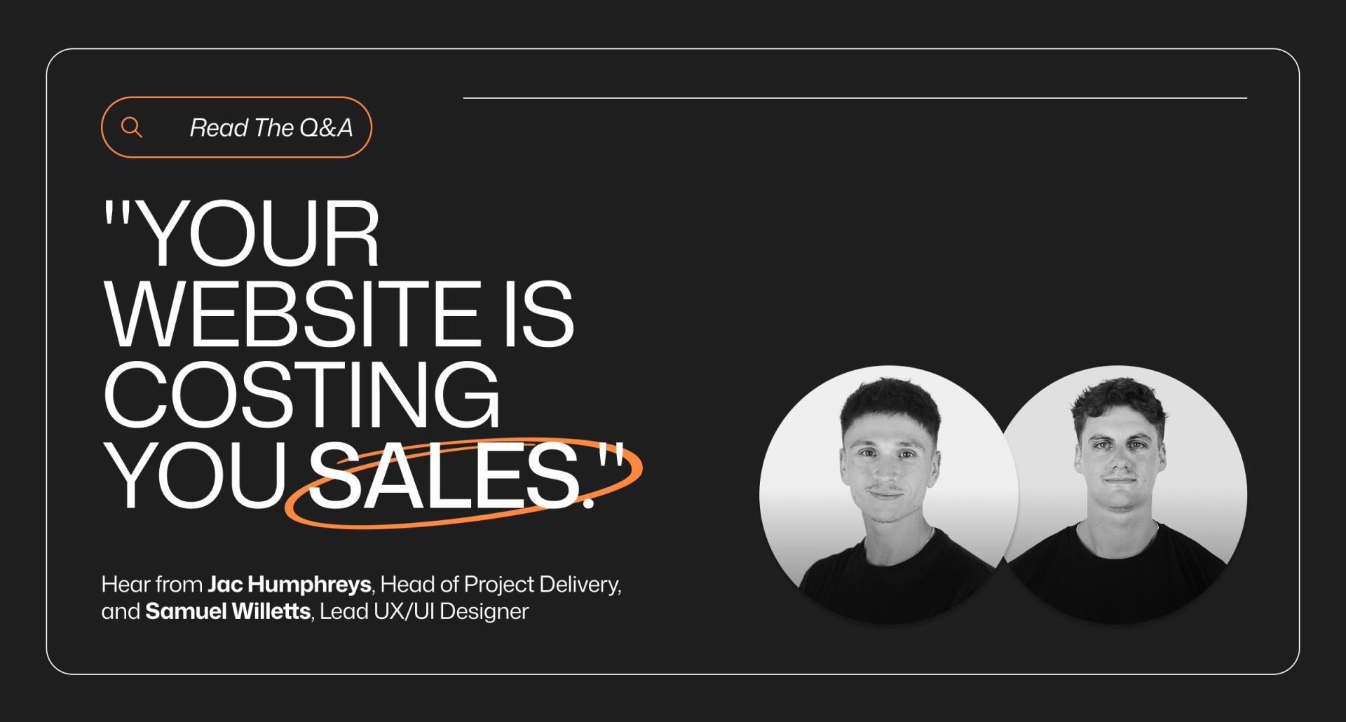
When it comes to building websites that actually drive results, most businesses miss the mark. In this Q&A, Jac and Sam break down the biggest pitfalls, the non-negotiables for success, and what the future of web design really looks like.
Q: What’s the #1 reason most websites fail?
Most websites fail because of poor user experience. You can have a gorgeous design and strong content, but if people can’t find what they need quickly, or the site is slow and clunky…they’ll leave. The biggest culprits are confusing navigation, slow load times, poor mobile optimisation, unclear messaging, and messy layouts.
At the end of the day, users want websites that are simple, fast, and easy to use. Focus on clarity and usability, and you’ll see engagement and conversions rise.
Q: Is design or conversion more important when building a website?
Conversion should always be the priority, but design is what makes it possible. They go hand-in-hand. Great design draws people in and guides them through the journey, while CRO ensures that journey actually leads to results.
A beautiful site without CRO is just window dressing. On the flip side, a conversion-focused site without good design can feel clunky and uninspiring. The sweet spot is combining both: clear CTAs, trust signals like reviews, and a design that feels seamless and engaging.
Q: If you had to cut 90% of features from a website, what would you keep?
I’d keep the essentials:
- The ‘Problem Scenario’ – sales and engagement is underpinned by emotion and whether someone positively resonates with you or the business. Concurrently, most prospective clients do not know they have a problem, so introducing a problem scenario, ramifications and solution (being your services or products) is imperative to connect with the end customer on an emotional level – leading to a higher chance of winning business!
- A clear value proposition at the top so people know who you are and why you matter.
- Mobile responsiveness – non-negotiable with so many users browsing on their phones.
- Simple, intuitive navigation.
- Strong CTAs that guide users to take action.
- Trust signals like testimonials or case studies.
- Basic but clear product or service info.
Strip away the noise, like endless popups, bloated content, or clunky forms and what’s left is a website that feels simple, trustworthy, and conversion-focused.
Q: What’s the most common UX mistake that kills conversions instantly?
Vague CTAs and overcomplicated forms.
If your button just says “Submit” or “Click Here,” users don’t know what they’re actually getting. And if you’re asking for too much information on a form, people won’t bother finishing it.
The fix is simple: use clear, benefit-driven CTAs like “Get Started” or “Book My Call” and only ask for the essentials in your forms. Less friction = more conversions.
Q: Can a $5K website ever compete with a $15K website?
Honestly, not really. A $5K site is usually built overseas by a developer alone. It may look fine, but it won’t have the strategy, UX design, or CRO focus you need to maximise marketing spend and generate real results.
A high-performing website isn’t just code, it’s research, design, testing, and optimisation. That takes a skilled team. You’re not just paying for a website, you’re paying for outcomes.
Q: If a site looks good but doesn’t convert, is it a failure?
It depends on the purpose. If it’s just a brochure site, then not necessarily. But if it’s meant to be your sales engine, then yes it’s missing the mark. Awards for design don’t keep businesses alive. Customers do. A good site has to balance looking great and performing.
Q: Why does SEO fall flat without good UX?
Because Google now cares about how users experience your site, not just the keywords. Slow load speeds, high bounce rates, and poor engagement hurt your rankings.
That’s why we make sure our sites score 90+ on Google Lighthouse for speed, accessibility, best practices, and SEO. The stats back it up: bounce rates can hit 85% if a site takes longer than five seconds to load. You can spend thousands on SEO, but if your UX is broken, it’s like pouring water into a leaky bucket.
Q: What’s one quick win anyone can implement today to boost conversions?
Add more social proof and sharpen your messaging. People trust other people more than they trust brands, so showcase reviews, testimonials, or case studies. Then make sure your CTAs and copy clearly explain the benefit to the user, not just what you do.
Q: How is AI going to change how we design and optimise websites?
AI is going to be an incredible support system. It can crunch data, test variations, and surface insights faster than we ever could. But it’s not a replacement for creativity or strategy.
The best websites in the future will combine AI-powered insights with human empathy and creativity. AI will handle the heavy lifting, but humans will guide the story and connect with customers on a deeper level.
Q: What’s one project you’re most proud of and why?
Two come to mind right away.
First, ENV Solutions. Their new site launched just over a month ago, and they’ve already seen a 62% lift in conversions, their best results all year. Seeing that kind of immediate impact is hugely rewarding.
Then there’s Red Education, which was the largest web project we’ve ever delivered at Digital Six. The whole team pulled together seamlessly – design, development, SEO and the client couldn’t be happier. Getting that call from them after launch was a career highlight.
Both projects remind me why I love what I do: it’s not just about launching websites, it’s about launching results.